Graph IDE ► Graphs ► Getting Data On A Graph
You should remember that Graph IDE is not only a data-oriented application. You do not have to start with data and then push buttons to see representations. You can draw the representation first and then embed data-oriented or even graphic-oriented "Vvidgets" which represent what you want. If you wish to work the other way around then see the primer Importing Data.
After drawing the representation then you can speed up the process considerably by putting your entire figure on a palette or using it as a template for a programmatic implementation.
What follows is a step-by-step example of making a typical graph.
Step 1: Click the graph type you would like from the Graphic Selector and then drag it out on the Graphic View of your Graph IDE document. You will end up with a very basic graph as shown below.
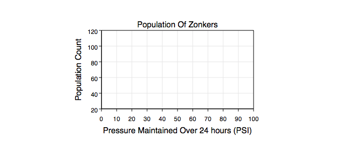
Step 2: Use the graph's main Inspector Editor to change the axis limit and tick values and the graph's Titles & Labels sub-editor to change the graph title and axis titles to reflect the data you would like to import.
Step 3: Select the selection cell from the Graphic Selector and then double click within the graph frame to focus on it. The focus path you just established is diagrammed in the Layer section. You will end up with a graph that looks like the following:
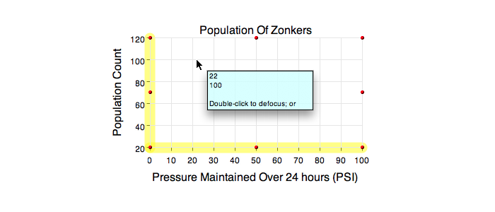
Notice the focus highlighters (yellow portion) on the baseline of both axes. This indicates the fact that any graphic you add will be associated with the coordinate represented by those axes. In a multiple coordinate graph which axis is highlighted is important and will tell you which coordinate you are focused on. Also note the Cursor Information Panel. The values it reports are in the dimension of the graph.
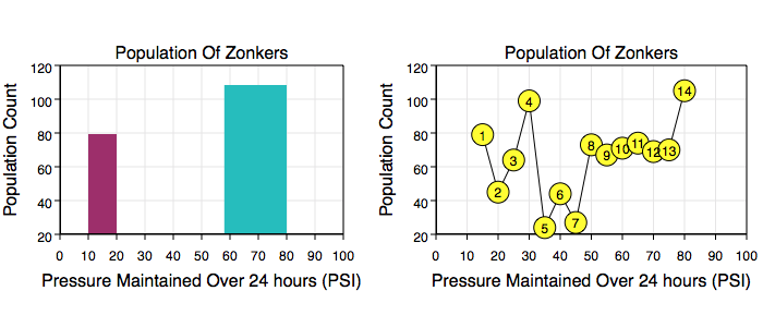
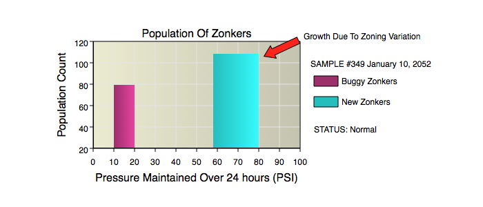
Step 4: Add the graphics you want. In the case on the left below, two Rectangles are added to show the fact that the data spanned 10 to 20 PSI and also 58 to 80 PSI and only one data point per pressure range is reported (such as an average of data over the interval of the respective domain). In the case on the right there is more data so it makes sense to use a Function graphic which has points as an attribute. The points can be entered as sequential white spaced x y values ordered from left to right (lowest to highest x-values).
After you add the graphics, then select the selection cell from the Graphic Selector again and double click to defocus from the graph's data layer. The focus highlighters will go away.
Step 5: After adding data and defocusing on the graph you can then add some supporting graphics to the same layer the graph is on (which is in the coordinate system of the page).
If you alter the graph such as moving it around or change its limits then the data representation (not the data values) will follow that change because you attached the graphical elements to the graph's data layers. Note that the data itself will remain intact, it is just its representation, i.e.: transformation from the graph coordinate to the page coordinate, that changes. You can refocus on the data graphics by double clicking as before, focus on them and change their graphical attributes. Navigating in and out of the graph's data layers is an important feature to understand.
Step 6: After making a few choice graphics you may want to put them on a Palette or even use the document they are defined on as a template for automation.